


ANTIQUITY is a conceptual brand following the wave of healthy sodas.
ANTIQUITY is different, though.
Instead of falling in line with the bubbly style of these brands, ANTIQUITY darts in the other direction. It embodies quiet 50s elegance in all its branding—hence its namesake “ANTIQUITY” or “GREAT AGE.”
Between the hand-drawn fun of its flavors and the vintage imagery, ANTIQUITY embodies an elegance that won’t just stand out amongst competitors, but dominate them.
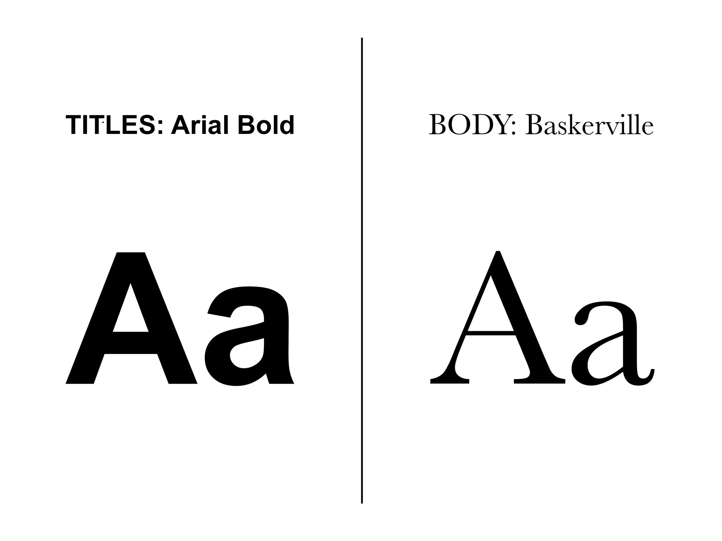
Of course, imagery and logos would be nothing without combining them. The way that ANTIQUITY does it is by leaning even further into its 50s heritage.
From classic, fun headlines to lengthy copy, ANTIQUITY takes no half-measures in its styling.
This is its greatest strength—this is how it stands out.
And stand out it does.
ANTIQUITY is a brand that encompasses a feeling, rooting new consumer directions in classic feelings that remain timeless on supermarket shelves.